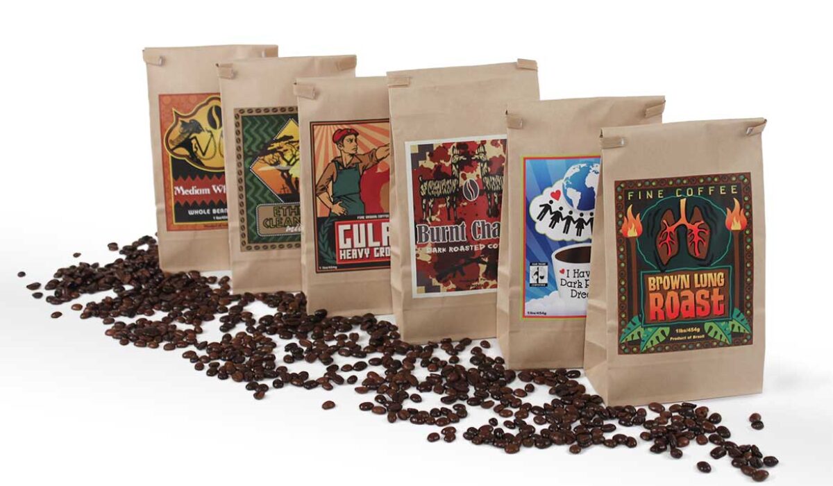
Javasploitation
“Javasploitation” is a series of six of illustrated labels that satirize the history and practices of the coffee industry. The labels reference the visual language of coffee labels typically found in popular coffee house franchises. Bright cherry colours and expressive designs attract the eye to an otherwise dark message. There is a theme of generalization which is present in the designs.
Read More ›
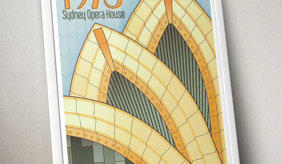
Sydney Opera House
This poster is an illustrated homage celebrating the architectural details of the iconic Sydney Opera House as well as the travel ads of the early 20th century.
Read More ›
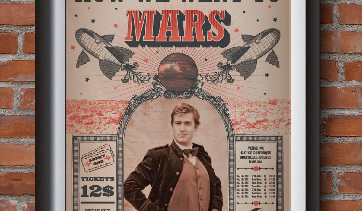
How We Went To Mars
This promotional package was created for Black Box Productions for their one-man theatrical show, “How We Went To Mars,” based on a short story set in the Victorian era by Arthur C. Clarke and preformed at the 2011 Montreal Fringe Festival. The design quotes the visual language of Victorian print ads, and uses a duo-tone colour scheme as well as large slab-serif fonts. The package includes a colour poster, press kit and promotional bookmark.
Read More ›